How can you tell that any Windows or Mac clone UI is a re-implementation? Easy: try to move your mouse diagonally into the Send To menu after letting it pop up. If the send-to menu closes as you mouse over the item into the submenu, it's a clone. If the menu stays up even if you brush over another menu item, it's either real or a Good Clone. :)
For the fun history, @DonHopkins had a thread a few years back:
There was an economies of scale back then with OS-level UI components.
If Microsoft spent money on UX research that improved its UI controls, it would benefit a lot of people. Essentially the cost of that research was bore by all application developers.
The problem now? Every company is designing their own UI components. Every company has to bear the cost of UX research individually. It’s a lot of wheel re-inventing. UX easily takes a backseat.
I work on design systems for an enterprise software company. I was talking with one of the engineers on the team about how great it would be if there were better built in browser-based solutions for things like autocomplete, select and multi-select.
As a side note: With the Internet (and myself) getting older and older, I appreciate the effort of the Internet Archive more and more. So many links I was able to revive thanks to a cached version. So many of my own works I was able to retrieve. It's a blessing, and not praised enough.
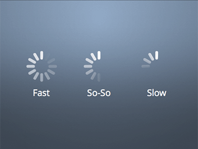
Man nothing drives me further up the wall than when a nice progress indicator with discrete segments gets animated with a lazy `to { rotate(360deg); }` etc[1]. It is my molehill to die on
You know talking about progress bars, it takes a lot of confidence to program a linear progress bar. You think you know when loading will be complete and think you know can break down the incremental progress made during loading.
Instead we get these spinning wheels that are like "maybe in the future this wheel will stop and we will have a return value." No confidence whatsoever.
I know this is true because Apple tries to implement progress bars in IOS like real chads. But their progress bars are just fake. They are a cheap animation all the way up to 90% and just stop moving until the progress is actually complete which could be 5 seconds of 90% and 40 seconds of the last 10%. So they think they are chad but lie.
> I know this is true because Apple tries to implement progress bars in IOS like real chads.
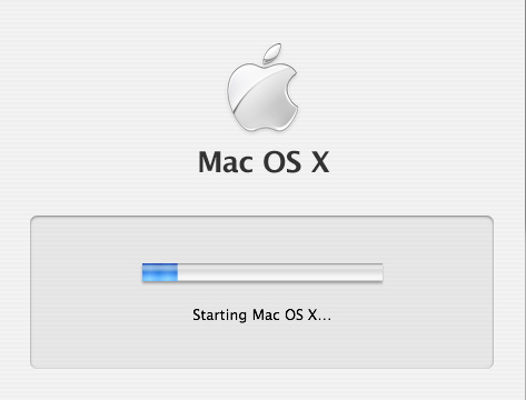
Back in The Day, Mac OS X Tiger just faked it by measuring how long it took to boot to LoginWindow, writing that number of seconds to a file, and displaying the next boot's progress indicator as a percentage of that time.
Power words: `/usr/libexec/WaitingForLoginWindow` and `/var/db/loginwindow.boottime`
Calling it fake also doesn't mean I'm calling it poor engineering; in fact the opposite since it's very accurate for the common use case of a computer that's used on a day-to-day basis with no major hardware or software changes. It's fake in the same way that illusion magic like slight of hand is fake. Its not lying to anyone about what it is, because it prompts your senses in a particular way that causes your brain to lie to itself! The slight of hand is this:
- Observable fact: Taking the computer from a fully-powered-off state to a usable state happens when the user presses the power button, involves loading the operating system from slower disk to faster memory, and takes some amount of time to complete.
- Observable fact: `WaitForLoginWindow` is the first “Aqua” UI element one sees after powering their computer on, the first visible thing that's drawn by the operating system that's being loaded instead of drawn by OpenFirmware or by BootX.
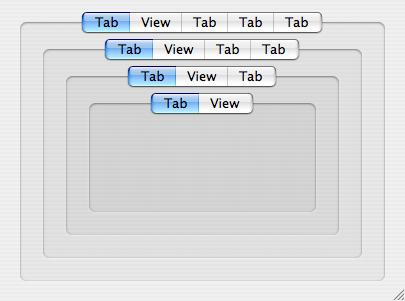
- Observable fact: Aqua has an `NSTabView` control used for grouping panes of related UI elements. In original 2001 Aqua, NSTabView looked like something that “stuck out” toward the user from a window. In Panther (2003) it was redesigned into something that looks “sunken in” to visually allow for nesting multiple layers of grouping.
- Observable fact: Panther-style NSTabViews get progressively darker as they are nested, indicating controls which are “more related”. See here for an example of four layers of nested NSTabView: https://cdn.arstechnica.net/wp-content/uploads/archive/mac-o...
- Observable fact: Any OS X user will be familiar with `NSProgressIndicator` as the UI control they see when they tell their computer to do something and some aspect of the computer itself (like disk or network bandwidth) is the limiting factor causing their action to be non-instantaneous.
- Observable fact: The progress indicator is the only part of `WaitForLoginWindow` that moves, and it's grouped with a text label reading “Starting Mac OS X…” in what looks to be a `noTabsBezelBorder`-styled `NSTabView` even though the grouping-box and even the “Starting” text are actually just a static image that the Wait window draws and overlays the progress indicator on, not really Aqua controls because the UI frameworks are still being loaded.
The coloration makes your own brain tell you that the progress indicator and the “Starting Mac OS X” text are as related as any two UI elements could possibly be, more related than any other pair of UI elements you will ever encounter in Mac OS X, because no reasonable application designer would ever nest four layers of NSTabView.
Since the progress indicator is so strongly visually grouped with the “Starting Mac OS X” text, and every Macintosh going back to 1984 has displayed some form of “Welcome to Macintosh” text while the OS is loading from disk, and progress indicators are the UI element for long-duration user-initiated work, and the computer was fully off so pushing the power button was the only thing the user did, and the wording of “Starting” means it isn't fully “Started”, then the progress indicator must represent how much of the OS is loaded in the current session, right?
A CorelDraw version from the 1990s I used had an honest progress bar. Sometimes it went backwards, but by the time it got to the end, it was truly finished.
I would imagine that progress bars generally represent the progression of the task state and not time, for that very reason. Or is that not the case in practice?
It is, but traditionally progress bars were often paired with labels showing estimated remaining time.
That said, back in DOS era, this kind of thing was much more straightforward because most operations that would warrant a progress bar involved some kind of disk I/O, which - if you amortize it - is fairly linear, so one can estimate the completion time relatively well. In more complicated cases - e.g. Win95 installer doing things like hardware detection - those estimates were often wildly off.
Progress bars are very hard. I implemented a PowerShell progress bar in a script I wrote, and even that was hard. The script did a nested iteration, deleting objects and re-starting the iteration. I updated the progress bar based on completion of the outermost iteration, but because of how things processed, the progress bar would move more or less logarithmicly; super fast at the start, but slowing down significantly at the end.
I'm sure I could have made the progress bar move more smoothly, but it would have required restructuring my entire program. (It probably needed it, but for a simple script I ran occasionally, not worth it.)
I second everyone talking about fake progress bars, but yeah I was just talking aesthetics. Having a progress indicator with obvious segments and animating it with a smooth tween looks wrong. Compare the above with [1], which is how Apple does it -
Back in the dark ages, "idiot dots" or "idiot marks" was a phrase I heard for the various text terminal equivalents.
It would cycle through a small number of text values with some kind of backspace/overwrite to keep things localized to where the cursor ought to be.
One version was a variable length ellipses: . .. ... that would grow and reset in place.
Another was an expanding "dot": . o O that would cycle in place as one character.
And the early "spinner" was: - \ | / that would cycle in place as one character. Hmm, not sure this will render properly on HN but it is hyphen, backslash, pipe, forward slash.
Also back then the movement of the symbols was kind of proof that the program was still running properly and not crashed because it had to be updating the symbols. But nowadays, waiting animations are independent of the thing they're waiting for and their movement isn't a sign of life but just a puppet made from a corpse.
this reminds me of a tool at work that uses a progress bar but the software doesn't calculate the job size so it just fills up quickly and then goes back down again, and repeats endlessly.
I don't have the time to research where I heard this, but I recall a UI focus group study that found pretty much equal user satisfaction between accurate linear progress bars and random progress bars, but universal dissatisfaction with progress bars that "reset". My own feelings mirror this finding.
I've had times where I aborted an operation that was obviously not working. Eventually out of ideas, I waited out the 1,163 seconds and it completed normally.
Another example, half of the stuff I tried had a different outcome from a actual Windows XP, on the systray, explorer side bar, what About dialogs were supposed to show, and so on.
There's something like this in every desktop Linux I've tried, which made it feel like using the mouse was in some way weird and broken. But I've been using it for long enough now that it either got fixed, or more likely, I got used to it. I don't even remember what it was, something about clicking drop down menus a certain way?
Reminds me of the first time I ever used classic Macintosh System OS, and how you have to hold the mouse button down to keep menus open. It doesn't take much to throw everything off.
I don't have an appropriate machine (virtual or otherwise) at the moment to check, but I believe this is another one of those things they screwed up around Windows 10 or so --- right-clicking on the Start menu and trying to get to the submenu that has the shut down / logout options was made significantly more frustrating because of it.
Have you considered that you can actually right click the start button, open a window, throw machine out of window? (I’ll get my coat!)(it’s cold out here collecting discarded pc’s)
In the web sphere, I recall Amazon having done something like this in the very early days when there was a sidebar with categories that you could kinda drill into. Mouseover one, and there was an invisible triangle off to the right that if you kept inside of, it wouldn't switch the current category.
It also fails the "hold right click" test, Windows didn't popover context menus until right click was released. Instead, for file, it did a kind of "contextual drag and drop".
If you have another option with a submenu on either side of Send To, the Send To menu will close. It closes as soon as you move over any item with a submenu. But it just so happens that Send To is typically by itself, so it's a good test regardless.
I must be a freak then because one of the first tweaks I do to any Windows install since possibly Win98 days is to set menu delay to 0ms. I like the snappy precise feel and have no problems not taking shortcuts across menu items.
I believe that anyone who isn't explicitly looking for it is subconsciously frustrated by the lack of it and they just don't know why the UI is "annoying".
It is slightly more than just a UI since all of the applications actually work (you can save and reload for example and still see your previous files too).
I remember being extremely envious of the "Alienware theme" that you could only get with an actual Alienware machine.
That was surprisingly short-lived though, such custom experiences are uncommon these days. Seems like nobody is theming Windows- they just fill it with crapware.
I remember those themes - the sleek "glowing" blue accents on shiny silver and black UI elements looked so fancy back then. There was a Windows Media Player skin too if I recall correctly.
Why theme it? For many people, it has three main functions: starting a game, starting Chrome, and starting MSO. All three kinds have their own custom look, or theme support. The native UI is barely visible, unless you're a heavy Explorer user.
More games ran on it (mostly thanks to higher DirectX version).
From developer perspective, XP was the first version of Windows with registration-free COM and side-by-side assemblies, which (if used properly by app devs) fully solved the "DLL hell" problem.
Lots of relatively small UI improvements that all added up. I honestly never noticed them until years later when I had to use a slightly older machine and had an "oh wow" moment.
Win2K did multiple users more or less the same, the only difference I remember from XP is the login screen that would list all accounts so you didn't have to type the username.
As for UI, it was very easy to switch to classic mode.
I was hoping this was emulation, like the windows 95 in js that exists, but its more of a simulator. The web browser doesnt work and the minesweeper game uses a text emoji instead of a picture for the face
Turns out you can just click and drag to select everything in Minesweeper, and it reveals all the hidden numbers. There’s even a sneaky little “debug” text in the bottom-left corner that shows where all the bombs are.
I also hoped it was actual emulation. I could tell it wasn't when I saw the bootup progress bar moving more smoothly than it ever did in real Windows :)
I was able to get the "browser" to work by opening the Flash Player and clicking the link to the Ruffle website. It's just an embedded view so some sites don't work (I think dependent on your browser settings.)
I feel slightly ashamed that I spent enough time using Windows XP that was able to spot that this was a clone based on the fonts and shadow effects alone.
It could be a badge of honor! You used the system so much that clones can't fool you. To be fair, Windows text rendering does have a very specific look that's difficult to perfectly replicate without using the actual Windows APIs.
I'm sure some here could look at a screenshot of the same text rendered on Windows, macOS, and Linux and tell them apart.
Yep. No web search. No ads or news or weather or links to apps that aren't actually installed. Opens virtually instantly. Lots of stock customization options (icon size, icon order, pinned icons, classic vs XP style, all shortcuts toggleable).
The only thing I miss is the search bar - I became quite used to that with Windows 7.
The Windows XP start menu sucked, no search function and it was common to have 3 columns full of shortcuts with folders inside folders. It only got better with Windows Vista.
Check out SmolXP [1]. The one I setup had a 340MB qcow2 image, took about ~10 sec to boot to desktop with qemu, and used only 58MB ram idling on desktop.
it's not an emulator -- it's a (very realistic) re-implementation of the desktop using standard JS and CSS. Flash is run through Ruffle. Edge opens pages using native iframes.
Essentially the browser split comes from the usual browser split: discrepancies in JS and CSS implementations
This means the developer hasn't tested it on Firefox. Platform compatibility is way better than it used to be but you still occasionally get differences in supported APIs or interpretation of the standard.
This is awesome! I recreated Win XP for my personal website a few years ago (https://www.sohailsayed.com/), but this completely blows it out the water on functionality.
I absolutely love just how much depth there is to the functionality in this (from being able to use apps like word, or being able to drag and move around icons on desktop).
Real thing is possible on https://copy.sh/v86/ I think but need an XP disk image[1], not readily available at the moment (probably for copyright reasons?).
Is 86box period-accurate for Windows XP? It seems to go up to Socket 370 (Pentium III) which is very early for XP. Additionally, from my experience using PCem (which 86box is based on), you need pretty beefy hardware to emulate a Pentium II or K6, let alone to go beyond them. And those are period-accurate for Windows 98, not XP.
God I miss Windows XP. I feel like, with a few small changes, the Windows XP GUI would be the most solid desktop experience you could possibly have.
Throw in POSIX compliance/bash, first party Linux compatibility (not WSL), window snapping, dark mode, maybe a spotlight-like search and a few enhancements to the file manager and you'd have a pretty much perfect desktop/productivity OS.
As I recall, XP had a background indexing process, to facilitate system wide search.
I distinctly recall having to turn it off as I had builds fail more than once because the indexer had a derivative file open that the build was trying to delete.
Locking open files has been a Windows pet peeve of mine for decades.
I daily drive Linux and deeply appreciate the fact that pretty much everything (at least in the DE space) is developed for free by people donating their time - so don't take this the wrong way.
...but I've yet to experience the level of DE stability you get from Windows XP/7
That also applies to Windows 11 (low bar, I know) and MacOS.
It is getting much better and that's happening very quickly - but there is always some jank.
For instance, dragging a Chrome tab off the current window to create a new window. The various file managers in Linux (dolphin, files, thunar) fall short (also MacOS Finder is an actual joke).
Also matching glibc versions when distributing software is a bit tedious
> ...but I've yet to experience the level of DE stability you get from Windows XP/7
Have you used Cinnamon? I used Cinnamon for five years and the only weird quirk is needing to change the keybind for locking the machine (Power key + L defaults to opening some stupid debugger).
This brings back so many memories I still remember having a cd with the serial key written right on it. Even now, that key is stuck in my mind qqwd7-8gr47-x9rcp-jjwh7-qpgqq
wow it's one of the most nostalgic feelings I've ever felt. Like coming back home after leaving for many years. And you still know your way around even though you already forgot you knew.
Check margin/padding in filename input line of "save file as" menu.
Ms Word is totally not real
Main menu font should be monotype if I remember correctly
Minesweeper has other fonts and pictures
Browser in browser can not work by some browser policy.
BTW the shot of nostalgy is MASSIVE
My favorite video player from that times was LightAlloy and Winamp 2.
People have been making these for a while. I used to see them on Flash game sites all the time as a kid. It'd be "Windows 96" or "Windows XD" or whatever else they decided to call it. They all had a start menu, notepad, maybe a calculator, and maybe a Minesweeper clone, and not much else.
Judging by the amount of Windows startup sound compilation videos out there, "the kids yearn for desktop UIs" might just be a little more common than you think.
I went through the "Install Windows" option just to hear the Windows XP installation music again. That track is such a vibe, I have loved it since I was a 14 year-old installing a pirated copy of XP in 2001.
Strangely enough, the first thing that some subconscious forces brought me to was to listen to Beethoven's 9th symphony (the file in media sub folder in the home folder).
The 1990s were very Information Superhighway (I get that's said in a mocking tone now for people who didn't actually know what the internet was, but I tend to use it unironically)
It's just a shame about the antitrust stuff and the bugs and glitches that came with MS Windows
People love to dogmatically claim that any appreciation for past design can only be chalked up to nostalgia but the XP design is objectively an excellent balance between UI 'gloss' and very simple and clear, unambiguous functionality.
People rarely complained that finding an application under the Start menu was difficult. In current versions of Windows, the Start menu is such a disaster, such a mess, that people don't even open it and rely much more on the search function.
I often have a hard time telling if I'm being nostalgic. For me, 7 was peak Windows, but Win2K/XP would rank pretty close as well. I suppose the question for me is what have subsequent releases given us; what can we actually do with more recent versions of Windows that we could not accomplish back then?
I was one of those people who stuck to classic theme all the way up to Win7, but that was the version that finally made me switch because the fancy default theme in it actually looked pretty well after they made the glass effects of Vista more subtle. WinXP looked like some kind of cheap plastic horror in comparison.
It's very funny to look at Apple progressing from "looks like Vista" to "looks like Win7" in its iOS 26 betas.
I switched from Windows 10 to Fedora KDE 2 years ago and it's been good. Not great, but good. I do have the occasional problem with drivers and whatnot, but honestly Windows was just as bad, just with different stuff, and Windows was much less stable and much slower
I also switched to KDE, and man, not needing an online account to use a operating system, not having any ads or constant spyware sending every click and keystroke to some ad partner is absolutely amazing. Sad that to get a decent user experience feels amazing, even though it's not really anything special, really goes to show how bad things have gotten.
I'm mostly a gnome 3 guy now, but mate is way underrated IMHO. I usually use it in VMs and the performance and usability is incredible. For those of us who grew up on this paradigm, it's a joy
KDE is bloated, but coming from Windows10 it feels very familiar but with all of Windows' extra shite (ads/tracking/sign in/fucking onedrive) chopped out. I couldn't be happier with it to be honest.
[edit]: I forgot to mention as well, at least on arch you dont have to install the (I forget the package name exactly) kde applications package off pacman, if you don't install it you'll need to install dolphin and a few other things but it really cuts down the bloat.
Yes, this. I'm a long time XFCE user but when I got a beefier machine I switched to KDE, and unlike XFCE it manages the hardware thoroughly enough (sleep/brightness/network/audio) that I don't have to manually hack anything. I tolerate the bloat for that reason. I disabled all the kwallet and pim stuff though, that was a mess.
It's bloated if you judge it by the standards of the WinXP era. And I'm not saying that's unfair, but realistically speaking, it's not an issue for any modern PC.
It must be using ActiveX, ah sorry I mean some feature that Google has unilaterally decided is part of the official web standard, soon to be known as the Chrome Platform standard.
Both the OS and Word 2003 run smoothly. It's quite a show. I think I might want to keep an old 16GB RAM laptop to run Windows 7, MS Office 2010 and VS 2012. I'll cut off as much Internet as possible and concentrate on my projects.
Edit: Just realized that this is not a VM, just a replicate. No wonder Word 2003 looks weird.
It is still nice to use old versions of Office. I think 2003 was my favorite. Simple, usable, no usage-based UI, no pop-ups like "look at this new feature we silently installed!" while you're trying to write.
On a whim a few years ago I wrote an engineering proposal on my Pentium MMX using Word 2003. It opened within 2 seconds via the aging hard disk. Today even LibreOffice feels a bit overwrought. I've found AbiWord delightful recently - it's the WordPad analog of LibreOffice.